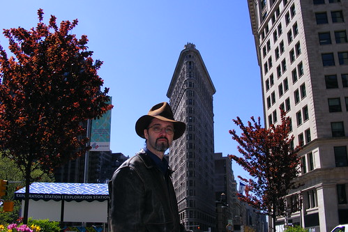
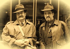
...for the Calgary Steampunk monthly meetup.
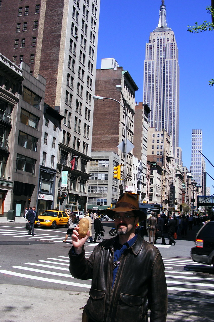
and for practice.
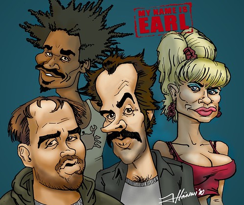
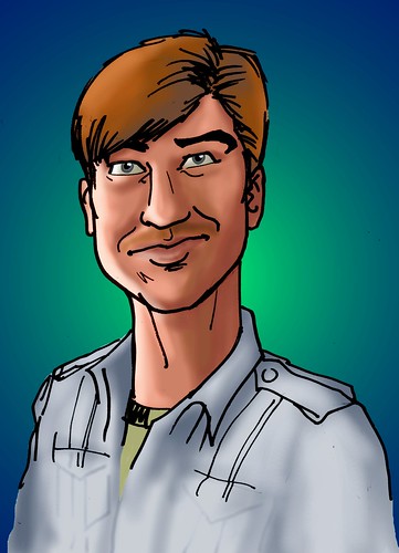
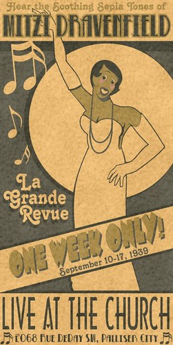
 Micheal the Squid
 Mitten Dog
 Please stand by.
 Save Second Base T-shirt design.
 The Jersey Devil.
 Vancouver Aquarium (rejected) T-shirt design.
 The girl in the fur bikini.
 Elvis Island.
 Canada Rocks T-shirt design.
 Film Production website splash/welcome screen.


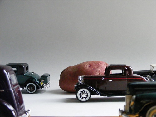


 This is a recent commission for Cherry Bomb Kustoms. They needed an image for general promotion and for business cards. So here it is. Kind of a fun one, but it took a lot of tweaking. Back in real cut-and-paste days, they had pencil pushers. I suppose I'm a pixel pusher.