Thursday, March 25, 2010

Not to be used as a personal flotation device.

My friend, Ms. Brannon, asked me to do her up a pin-up style logo in a circular design. I made it nautical to fit with her company name 'Dreadnought Designs' and even put that on the life preserver. The cartoon is computer coloured pen and ink and the life preserver is straight vector created entirely in the computer.


You can see the banner 'in situ' at her blog.

Friday, March 19, 2010

Graphic work


I was asked to update a 1940's business card for a client. It belonged to a relative of his and I suspect it's as much a tribute as it is just a plain cool design. I didn't have the long lost type styles as the original had; I suspect they existed only as movable lead type, but I think I caught the period feel with similarly deco fonts. I did away with the hand drawn shading on the city because I thought the solid (or a halftone) would be bolder and more graphic as well as thinking the lines might not print well.

Oh, and he wanted a dirigible. Well, who doesn't want a dirigible?! Wouldn't make sense to leave it out considering the company name.

This one was fun to do. Often many different clients will ask for the same damn bulldog they've seen on someone else's logo and can't be convinced that maybe a new one would be better. Those kind of copies are the kind I find boring, as opposed to this rare and historical reproduction and update. These are what I enjoy.

Sunday, March 7, 2010

Learning lots!

've been watching (participating through live chat) Lar deSouza's "Lartist at Work" Ustream Friday nights. Lar usually draws the Sunday version of Least I Could Do and people watch and learn and ask him questions which he answers live. This guy's a very talented artist, but moreso than that, he's happy to share what he knows. I've been using graphics programs for many, many years - but everyone uses each program differently. There's a bzillion ways to do any one thing on any program, but Lar is a Photoshop guru. And immensely patient answering the same questions over an over. He's a great teacher for sure. Anyway, since I've been absorbing his tricks and tips, my own work is improving vastly (in my eyes).


I am so much faster than I ever was and mistakes are far easier to correct now. I got two of what would've taken me a whole work day done today; the beer label previously posted and the zombie cartoon above. I'm most impressed with myself.

The subject, Ms. Michele, is a movie makeup artist specializing in the gory stuff. It's probably been over 20 years since I drew zombies. This one seems odd, but all the elements were requested and Ms. Michele has been known to dress just like that while out shooting. Her pet bird really has a hoodie too. I won't type the bird's name; this is a PG-13 blog. Zombie gore not withstanding.

So, thanks for the education, Lar! It's helping quite a bit!

Thursday, March 4, 2010

Slightly more graphic

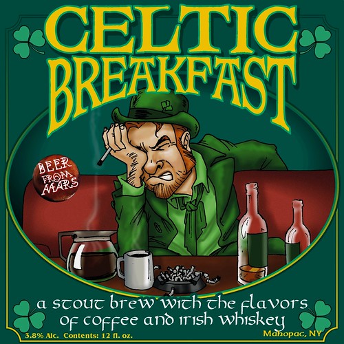
I do a lot of graphic art as well as just cartoons. All fonts and layouts and such. Below is a label for a micro-brewed beer in Mahopac, New York. Micheal S., the brewmeister, himself an Irish Italiam American said, "It's comical, slightly insulting and fairly accurate."


And the beer really is flavoured with coffee and whiskey!

This is a recent commission for Cherry Bomb Kustoms. They needed an image for general promotion and for business cards. So here it is. Kind of a fun one, but it took a lot of tweaking. Back in real cut-and-paste days, they had pencil pushers. I suppose I'm a pixel pusher.